Visual Identity | Municipal Library of Kalivia
Logo design for Municipal Library of Kalivia, Saronikos
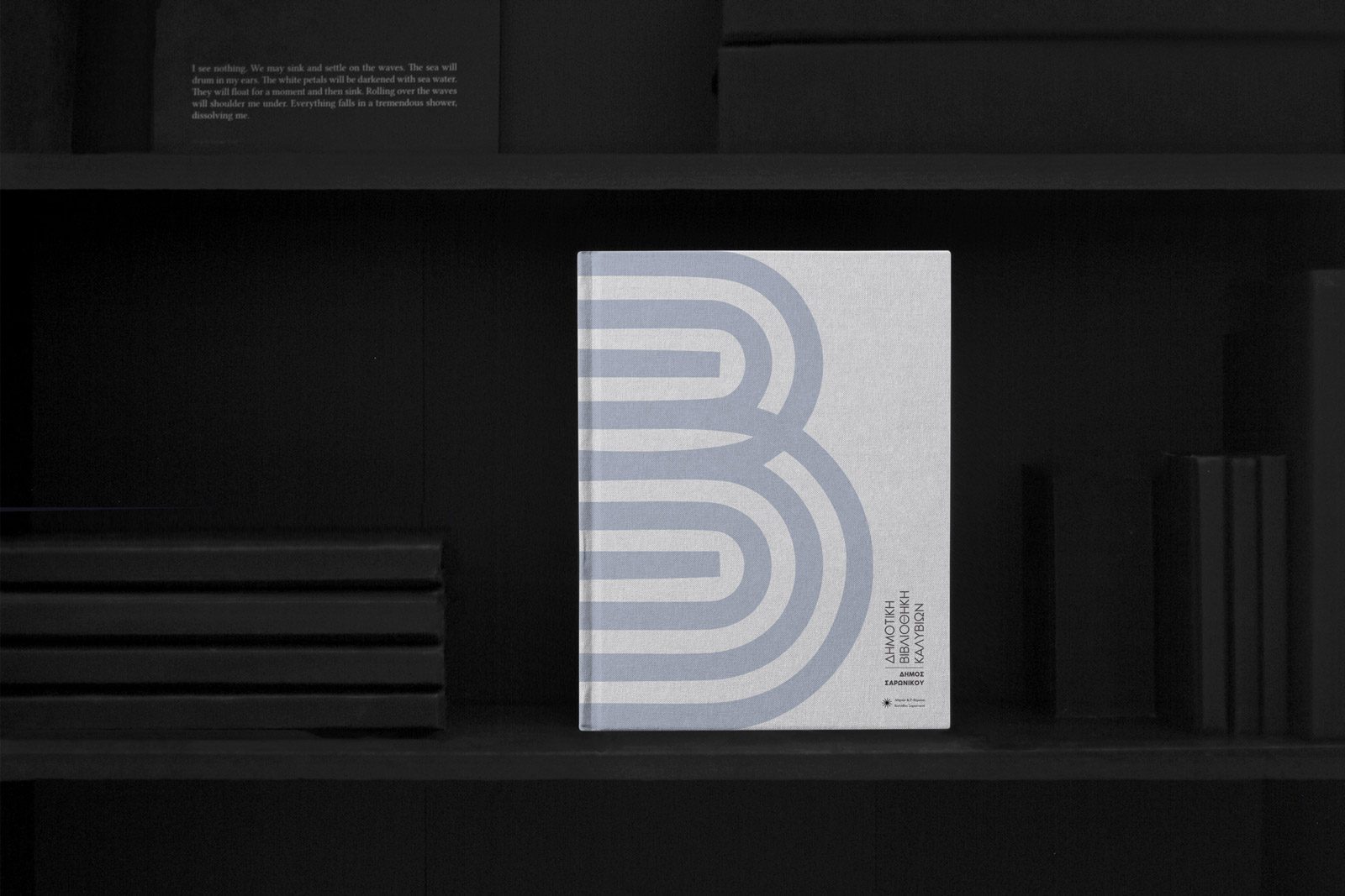
The logo aims to embody library’s identity as a space for growth, discovery, and connection. It features two groups of parallel lines that intersect in a dynamic and engaging shape, representing the letter “B” (B stands for Βιβλιοθήκη which means library in Greek). They symbolize the interconnectedness of ideas and knowledge that can be found within the library’s vast collection of resources. Additionally, the logo’s shape resembles two doors, symbolizing the entrance to the world of knowledge and reinforcing the library’s mission to provide access to information and knowledge for all.
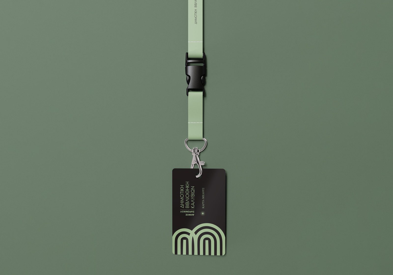
To lend the logo a timeless quality, we chose to use black and white. The addition of pale blue and pale green as secondary colors conveys a sense of calmness, stability, growth, and balance. The logo’s versatility makes it suitable for various applications, from print materials to digital platforms.
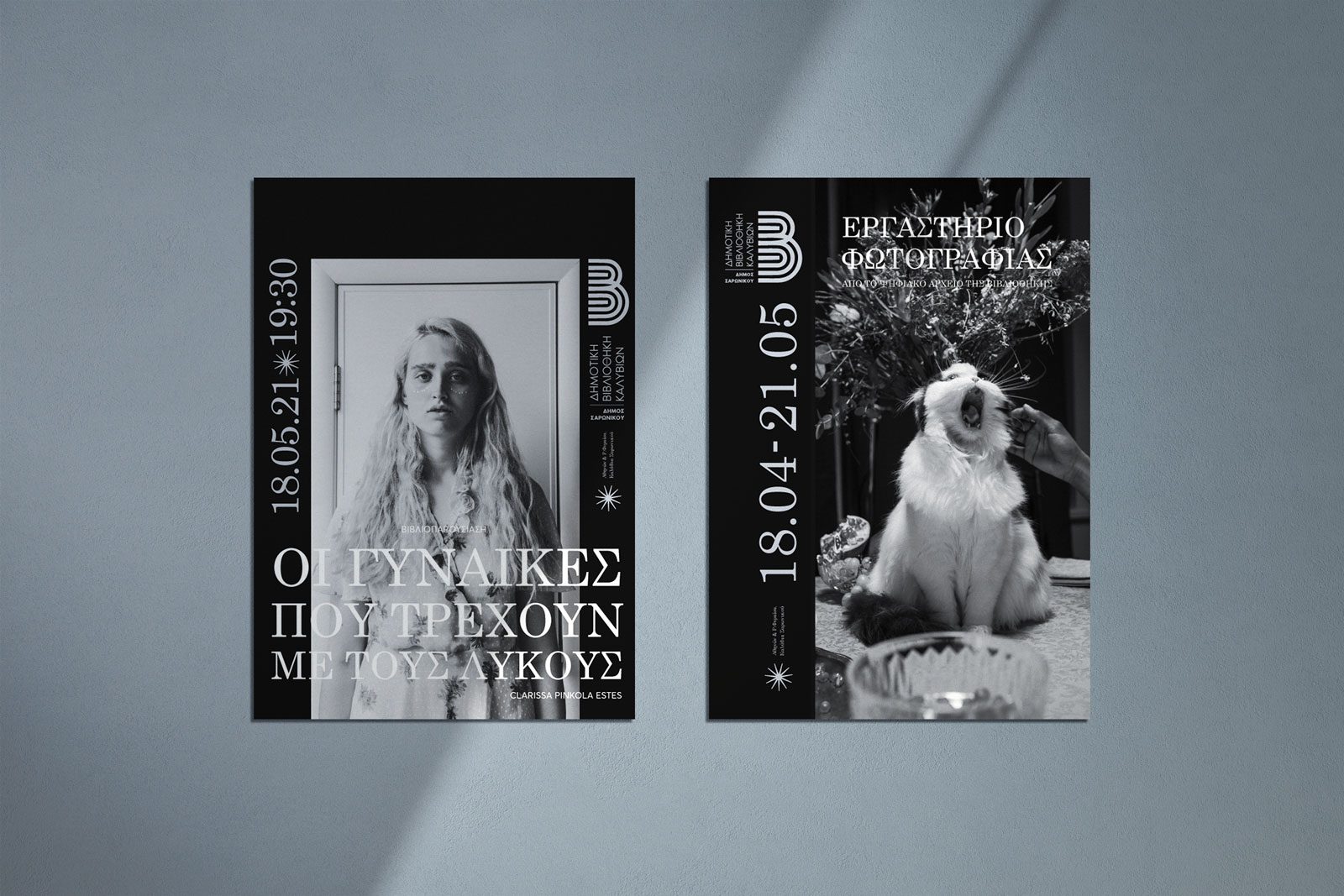
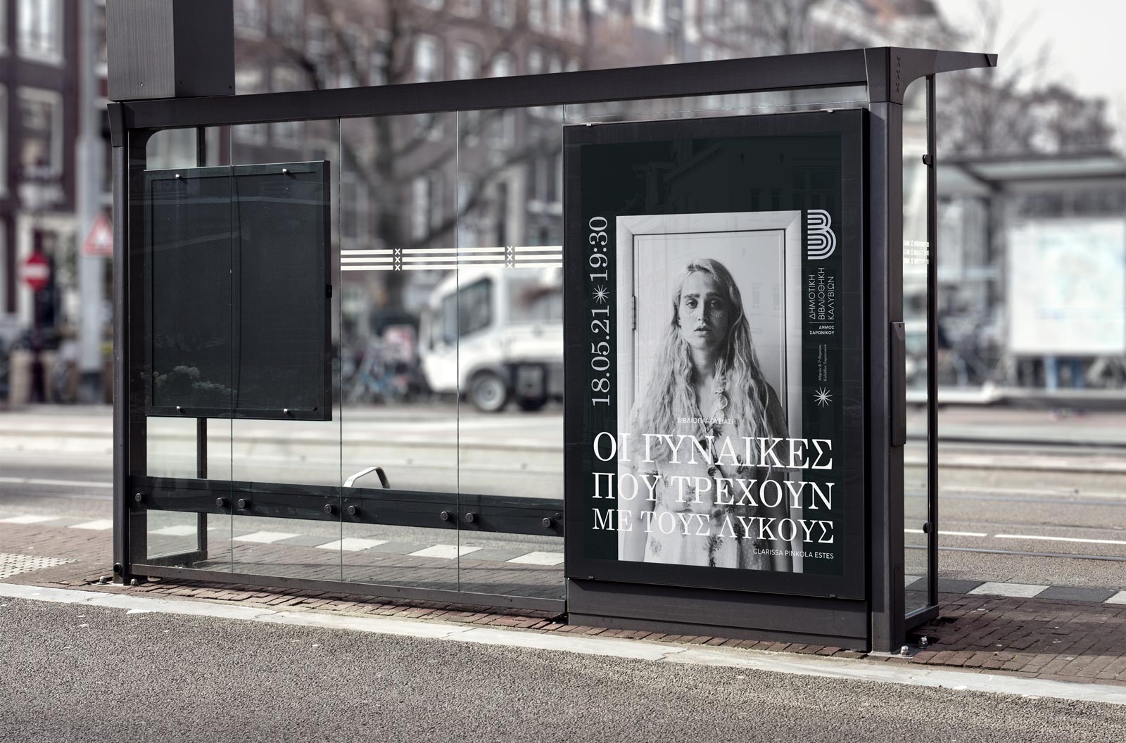
To further highlight the logo’s potential as a recognizable and effective branding tool, the logo design is accompanied by a proposal for the presentation of the library’s events and its promotional merchandise.
Services
- Logo design
Designer
- Christofili Kontolefa


